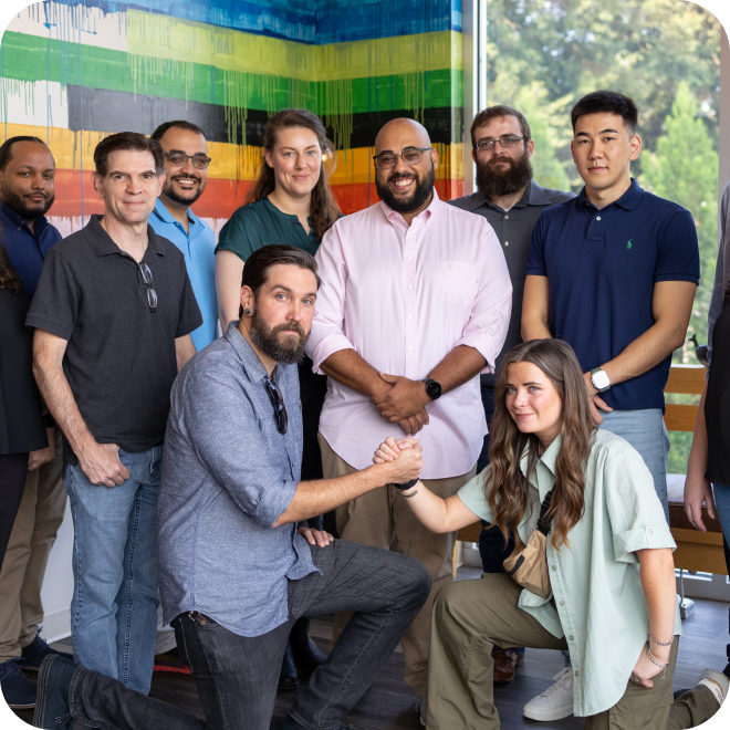
Our people make our business
About Us
We are a software company on a mission to provide the most innovative companies with the most innovative solutions.
Based in Atlanta, Ready to Serve the World
Our story.
Stable Kernel is a digital transformation company based in Atlanta, GA. We have a track record of helping our partners solve their biggest challenges on their digital journey, whether they need insights or implementation. Every day, millions of people rely on software that we developed, and our custom software development and technology services have been trusted by some of the most innovative Fortune 500 companies in the world.
Who we are.
We're a talented and diverse group of thinkers who love to learn and share our expertise with our colleagues and clients on some subjects we are extremely passionate about.
Digital Dot Connectors
Without a true partner the digital world can be a scary place, but there's no need to fear. We're here to make all the code and data points come together to become tangible, business-defining solutions.
Technology Translators
We don't do jargon. You need game-changing solutions, not big words that confuse and intimidate. We serve as a trusted companion from start to finish. You'll never have to worry about understanding what you're hearing.
Market Research Ringleaders
Data can feel like a circus. We're the steady hand that guides you through the acrobats and fire-breathers, helping you make it out unscathed with a clear plan, ready to make informed business decisions.
Industry Innovators
There's never been a one-size-fits all solution to technology problems. We don't stop at the answer - we look to clear future hurdles before they have a chance to show up.
Our leadership team.

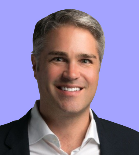
Jason Russell
CEO & Co-Founder
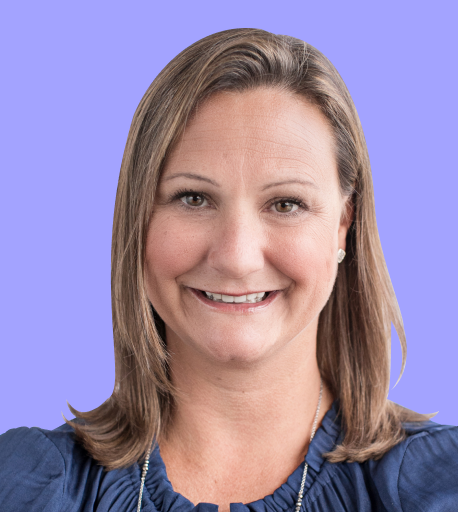
Mary Elzey
Chief Strategy Officer

Jami Sieder
Chief People & Culture Officer
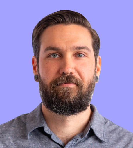
Bradford Dillon
Chief Technology Officer

Matt Mills
Vice President of Operations
Jay Gyuricza
VP, Customer Experience & Business Development
We solve problems
Our approach.
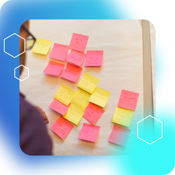
Our approach to each project starts with fresh, creative thinking. We love analyzing challenges and deciding which of our services we can employ to provide solutions. We draw from both our past experience and our knowledge base as subject matter experts. We don't believe in one-size-fits-all, but tailored solutions for sustainable success.

We're more than apps and graphs
What sets us apart.
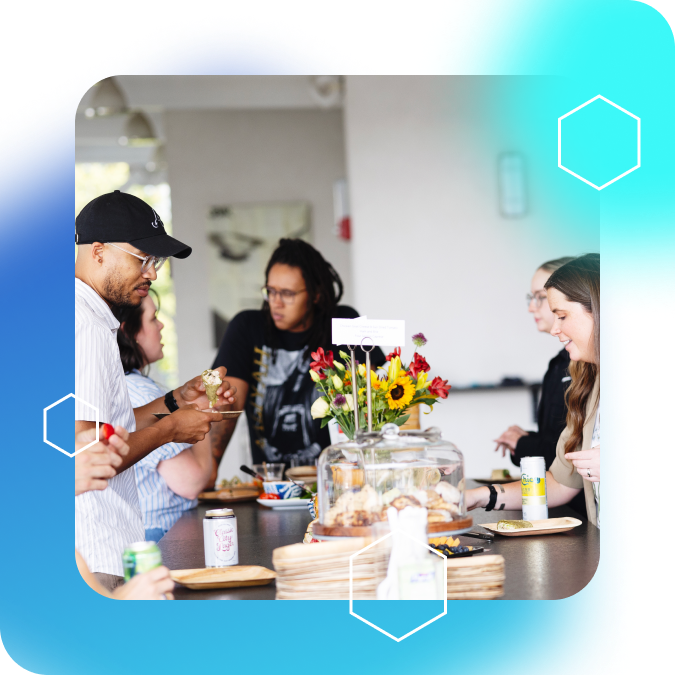
Stable Kernel’s work environment is healthy, intentional, and collaborative. Our company isn’t a blip on our team members’ resumes — it’s a place where careers grow. We believe in our work, we believe in our team, and we believe in the common goals we set with our clients. When disagreement sets in, we respectfully and constructively work through problems for even better outcomes. Stable Kernel has built an environment where people can do their best work, while establishing trust with our clients and their stakeholders.
Join our team.
We're a collection of problem solvers on a mission, and we're always looking for our next great colleague. If you think you would be a good fit, please see our current job listings or join our talent pool to be notified about future opportunities.
Ready When You Are
Book a consultation.
We're always looking for our next opportunity to help a partner expand and transform their digital operations. You can take the first step today by clicking below to book a consultation.