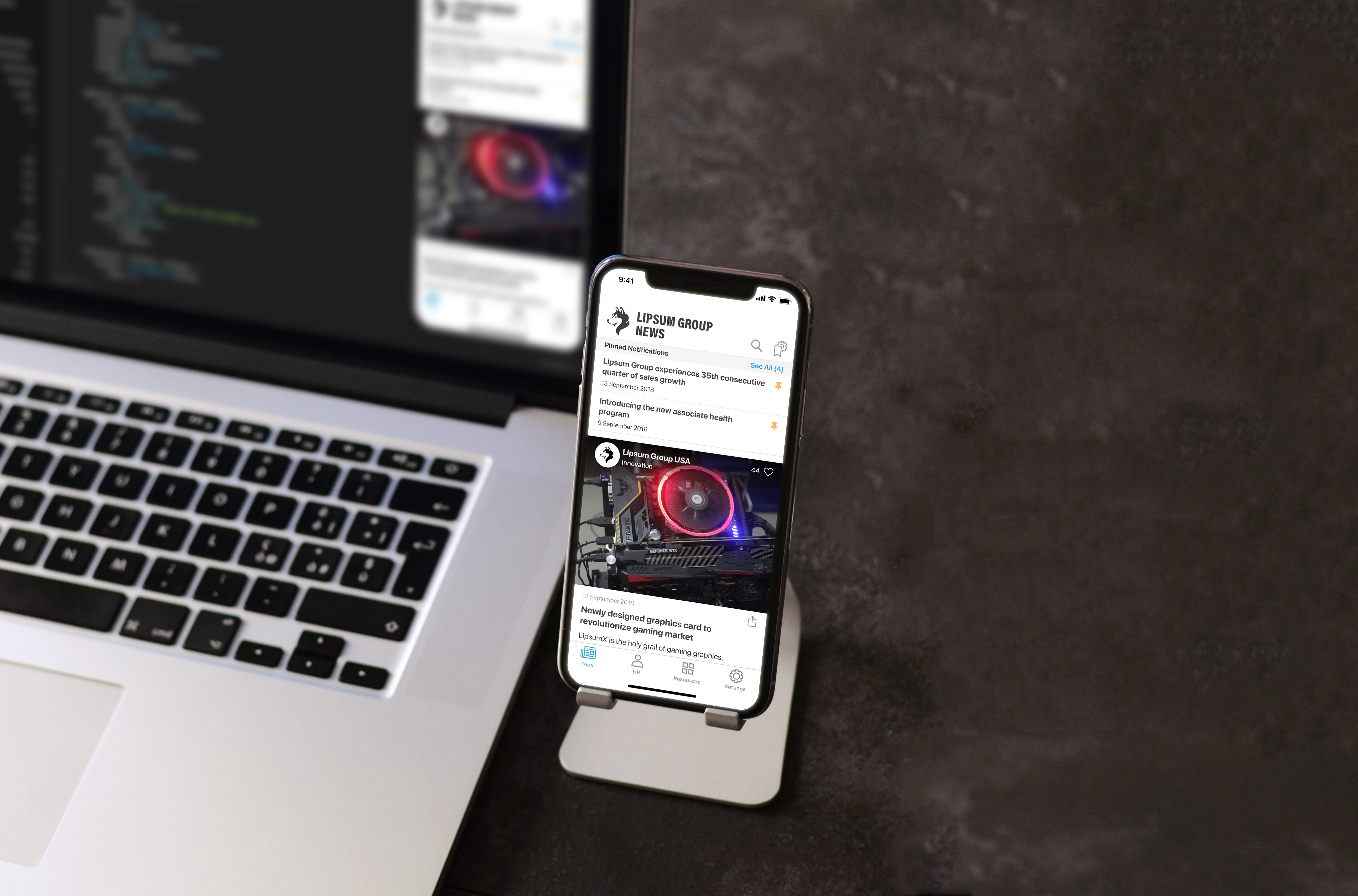
It’s common for a UX designer to receive requests for things that benefit your company that extends beyond your client work. One request that is common within the design department is creating high-fidelity animated prototypes for new business pitch work. Usually, these requests come with a one-week timeline, so it’s necessary to cut some corners off the full UX/UI design process. Well, more like all of the corners — an assignment like this is a nitro-fueled hell ride toward greatness, a thrilling challenge that appeals to anyone who yearns for the chance to eat and sleep poorly for several days with the hope of coming up with something profound and persuasive.
When this process works and we land a project based on this rapidly-assembled prototype, we sometimes find ourselves in an awkward position. To the client, it may appear that we just did all of the work we estimated would take several months in the span of a week. Any kind of user research, preference testing, user interviews to determine what features matter most for a v1? Nope. Detailed analysis of competitor apps? Forget about it. A robust map of the application flow that includes all screens in their various states? Definitely not. Wireframes for flow testing with basic clickable prototypes? No, friend. We walked into the woods and came back out one week later with a trophy — a fully branded and smoothly animated tappable prototype, sporting quite a bit of assumed functionality. And the client loves it.
Shouldn’t we re-estimate how much UX work will be required on this project? What’s even left to do? Well, in a word… everything. So begins a long and arduous process of resetting client expectations and defending the need for a discovery period even after the app appears to be largely finished. But that’s the topic of another blog post. Today, I want to focus on the practical consequences of delivering a hi-fi pitch prototype the client loves: a messy as hell Sketch file.
Building a nest
Since Bohemian Coding introduced nested symbol overrides in Sketch 41, the world has changed for UX/UI designers. Finally, there is a widespread and easily learnable system for designing with Atomic design principles. This has revolutionized UX and UI design, and organizations like Airbnb have made tremendous strides in creating a standard model of comprehensive design systems.
It’s now easy for designers to think like developers when building out a flexible and scalable system for any product, to design with confidence, elements that will scale and accommodate dynamic content. Designers are now designing as little as possible, with the aim of making documentation and implementation easier for developers and making future revisions easier to handle. Nested symbols and symbol overrides make Sketch a tremendously powerful design tool, and we’re using these practices for every new project we work on.
There are two problems with this process:
- It’s very time-consuming to build a system piecemeal as you go because you’ll spend a lot of time re-editing and refining your symbols, color styles, and text styles while you’re still in the process of designing a whole app from scratch at once.
- It’s very time-consuming to go back and fix a superficially pretty but extremely disorganized Sketch file, even if you’ve used some symbols in the first place to make things easier.
Once this dynamic, scalable system is in place, it’s easy to maintain and customize. But getting there poses significant challenges — and requires an awful lot of refactoring.
Refactoring Design
Refactoring is a daily practice for developers: “Code refactoring is the process of restructuring existing computer code—changing the factoring—without changing its external behavior. Refactoring improves nonfunctional attributes of the software.” (thanks, Wikipedia!)
Designers are used to the progressive refinement of designs. We usually prefer to treat it as a part of the larger design process. But I’ve often struggled to articulate to our developers why a design wasn’t ready for documentation and what exactly I was doing by ‘refining’ designs – and why the hell it was taking so long, when the comps looked finished. Then I realized there was already a word for what I was doing. ‘Refactoring’ clearly expressed the tedium of cleaning sketch files, and renaming and reorganizing symbol structures to honor the principles of DRY (Don’t Repeat Yourself) and KISS (Keep It Simple, Silly :)). More importantly, it’s a word that resonates immediately with my developer audience.
It might seem like a matter of semantics, but explaining this step of the design process in this way has been helpful in improving communication between design and dev, and it can even make it easier to explain our process to more technically-oriented clients.
Tackling Design Debt
So, how do we refactor our designs?
- Consistent Colors. Drag all visual and type elements together and visually compare them to figure out what extra shades are unnecessary and then trim them out.
- Systematize type. Drag all unique type assets into a single location and then trim the fat to create several global type styles, and then run back through the entire app and apply them universally. Piece by piece. Make sure type styles are named appropriately – there are some different schools of thought on this since certain names integrate more easily with native iOS accessibility shortcuts, but right now I’ve found it useful to name type styles by their basic attributes, rather than generic “body” or highly specific location/function names.
- Curate, rename and reorganize symbols. Get rid of the extra symbols that are no longer being used and take the time to make sure all symbol assets are falling on full pixels to avoid weird anti-aliasing issues. Create a naming system for your symbols to make it easier to find and replace them. Further, you should take this time to specify resizing rules for your symbols so when you have to take this design from mobile to tablet, you won’t have to redesign everything. Oh, and you’ll probably want to install the amazing Symbol Organizer plugin by Jason Burns.
- Replace any straggler design elements with symbols and double-check all measurements. It takes time and patience, but go screen-by-screen and make sure your repeated design elements are symboled out. Sketch Runner is a fantastic plugin for Sketch that makes it super fast to drop in symbols. This is also an ideal time to make sure your symbols are all on grid. We like to work on an 8pt grid – 4pt for details – and there are some helpful tools out there to turn your default nudge amount to 8pt in Sketch (since Bohemian Coding hasn’t added custom nudge values as a feature as of May 2017).
- Generate a style guide. There are a lot of tools to automate this process, but I haven’t found any of them to be perfect. I still like to generate my own pullsheet for colors, type styles, and icons.
These are the basic steps I follow every time I need to quickly refactor a design. It’s an evolving process and it’s sure to change — but so far it’s made for better documentation, happier developers, and a much easier time making changes and coming up with brand new features. If you do this sort of work too and have any other suggested practices, sound off in the comments!


